Enhanced Responsive Web Design: RWD++
Luca Corbo - Sr. Software Engineer @ ScientiaMobile.com
Google I/O Extended 2017 - Naples - Italy

Source: https://vignette1.wikia.nocookie.net/onceuponatime8042/images/4/4e/113Book.png
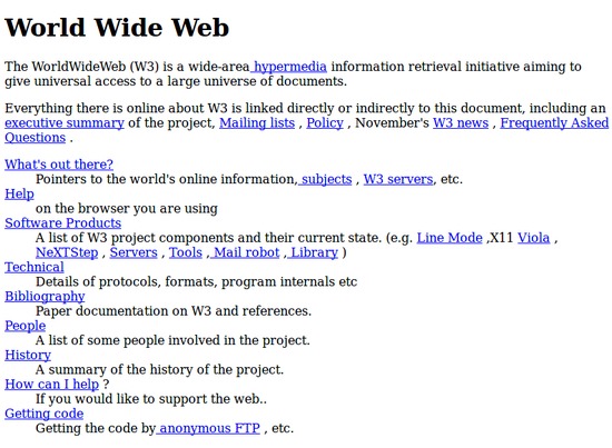
1990
Source: http://info.cern.ch/hypertext/WWW/TheProject.html
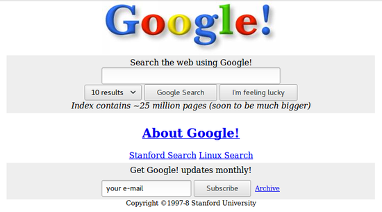
1998
Source: https://web.archive.org

2017
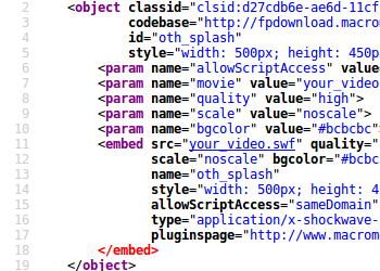
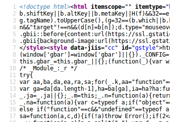
Show me the code!
Everything changes!
Not only the code...
1980s Desktop & Mobile ...
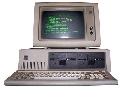
IBM PC 5150
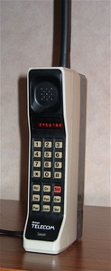
Motorola DynaTAC 8000X
Sources:
- https://en.wikipedia.org/wiki/File:DynaTAC8000X.jpg [CC BY-SA 3.0]
- https://commons.wikimedia.org/wiki/File:IBM_PC_5150.jpg [CC BY-SA 3.0]
- https://en.wikipedia.org/wiki/File:DynaTAC8000X.jpg [CC BY-SA 3.0]
- https://commons.wikimedia.org/wiki/File:IBM_PC_5150.jpg [CC BY-SA 3.0]
... Nowadays
Source: https://www.flickr.com/photos/brad_frost/7387823392/
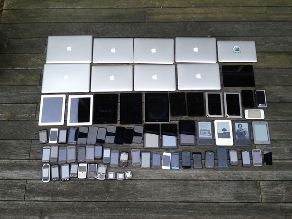
Device Fragmentation (1/2)
Source: https://www.scientiamobile.com/page/movr-mobile-overview-report
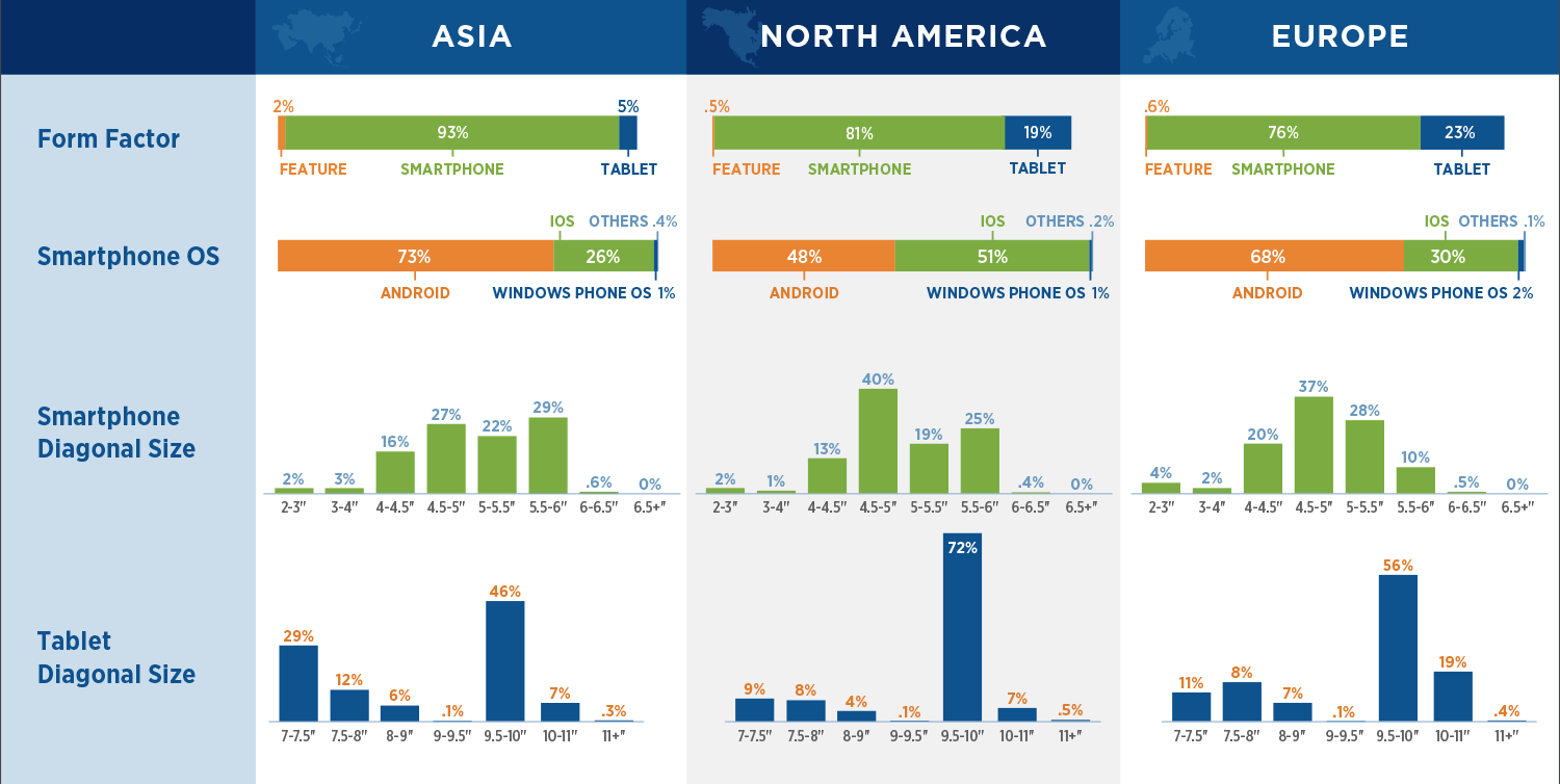
Device Fragmentation (2/2)
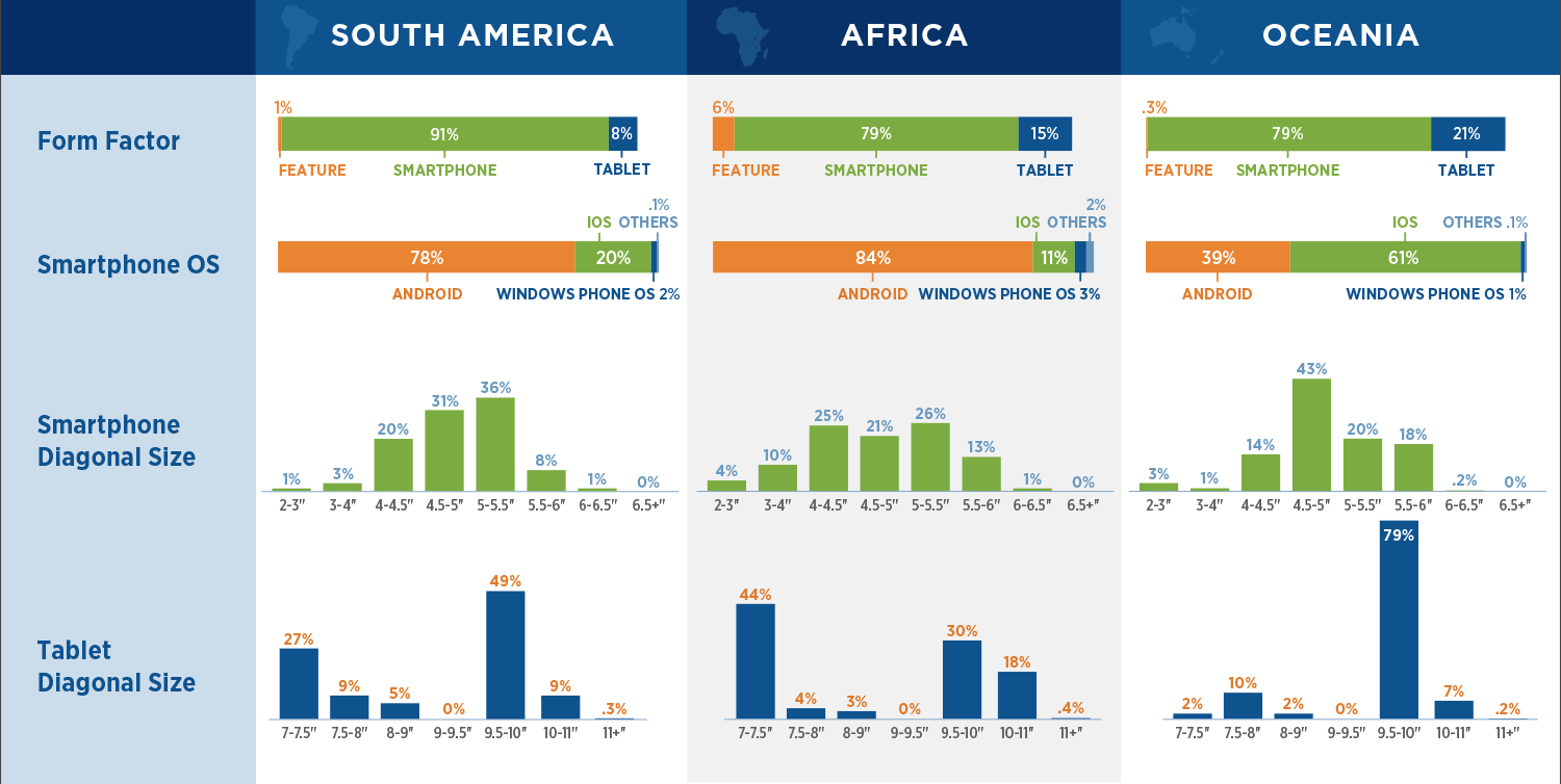
Source: https://www.scientiamobile.com/page/movr-mobile-overview-report
Trends
Mobile Market Share (%)
Source: https://www.slideshare.net/jonarnes/rwd-myth-busting-topconf
Web Page Weight (kB)
Sources: https://www.slideshare.net/jonarnes/rwd-myth-busting-topconf
Image Transfer Size (kB)
Source: http://httparchive.org
Let's focus on the content
Total: 2602kB
Average Bytes per Page by Content Type - April 2017
Source: http://httparchive.org
Let's focus on the content images
Source: http://httparchive.org
The value chain
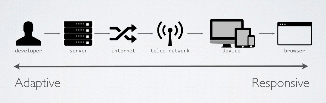
Source: https://www.slideshare.net/jonarnes/rwd-myth-busting-topconf
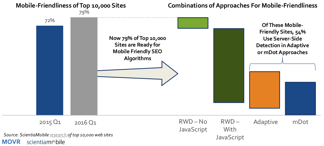
Mobile Friendly Approaches
-
In early 2015, Google changed their algorithms reflect the
mobile friendliness of a website. The press dubbed this event
"Mobilegeddon".
Now, in 2016, we reran our survey of the top 10,000 websites. - In 2016, 79% of sites are "mobile friendly". This is a 7% increase over the 2015.
- People think Responsive Web Design (RWD) is synonymous with "mobile friendly." However, less than 20% of mobile- friendly sites are using just RWD without javascript.
- The web-performance movement (#webperf) is recognizing how RWD code can unnecessarily slow site performance.
- To solve this, many sites combine server-side Device Detection – found in Adaptive and mDot – with RWD to reduce front-end payload, reduce JavaScript code, and improve speed.
Ok, we need a web page...
            <html>
              <head>
                <meta name="viewport" content="width=device-width,initial-scale=1">
                <link href="style.css" rel="stylesheet">
                <title>My Awesome Page</title>
              </head>
              <body>
                <p>Hi everyone!</p>
                <img src="awesome-photo.jpg">
              </body>
            </html>
... and make it responsive
Let's start with RWD!
Responsive images!
            <html>
              <head>
                <meta name="viewport" content="width=device-width,initial-scale=1">
                <link href="style.css" rel="stylesheet">
                <title>My Awesome Page</title>
              </head>
              <body>
                <p>Hi everyone!</p>
                <picture>
                    <source media="(min-width: 36em)"
                            srcset="awesome_photo_large.jpg  1024w,
                                    awesome_photo_medium.jpg 640w,
                                    awesome_photo_small.jpg  320w"
                            sizes="90vw">
                    <img src="awesome_photo.jpg" alt="Awesome photo!">
                </picture>
              </body>
            </html>
Can we optimize?
What about WebP?
- A new image format for the Web introduced by Google
- WebP lossless images are 26% smaller in size compared to PNGs.
- WebP lossy images are 25-34% smaller than comparable JPEG images
- Natively supported in Google Chrome and the Opera browser
Source: https://developers.google.com/speed/webp/
Responsive images with webp!
                <picture>
                    <source type="image/webp"
                            media="(min-width: 36em)"
                            srcset="awesome_photo_large.webp  1024w,
                                    awesome_photo_medium.webp 640w,
                                    awesome_photo_small.webp  320w"
                            sizes="90vw">
                    <source media="(min-width: 36em)"
                            srcset="awesome_photo_large.jpg  1024w,
                                    awesome_photo_medium.jpg 640w,
                                    awesome_photo_small.jpg  320w"
                            sizes="90vw">
                    <img src="awesome_photo.jpg" alt="Awesome photo!">
                </picture>
Wait... are 3 breakpoints enough for a responsive web site?
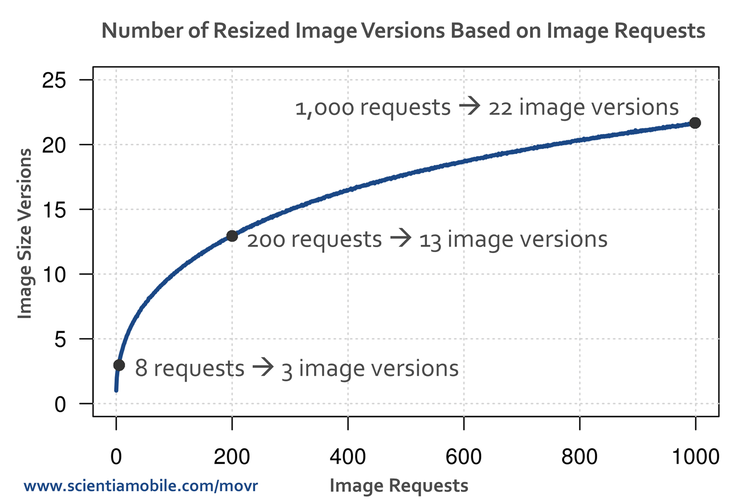
Responsive Web Design + Server Side Components (RESS) can help
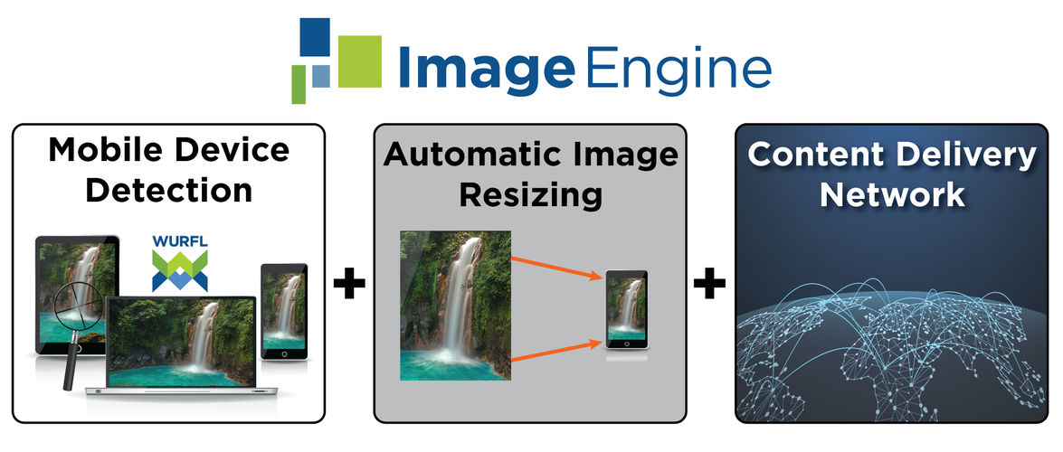
Device Intelligence

- Accurate, Real-Time Device Detection
- Over 50,000 device profiles
- 500+ capabilities
- 11 languages supported
- 7 server modules
Device Detection
server side
                // Create a new instance of WURFLEngine
                $wurfl_engine = new \ScientiaMobile\WURFL\WURFLEngine($container);
                // Get the device for the current request
                $device = $wurfl_engine->getDeviceForHttpRequest();
                // Get the value for a capability
                if ($device->getCapability("ux_full_desktop")) {
                    echo "This is a desktop device";
                } else {
                    echo "This is a mobile device";
                }
Device Detection
client side with WURFL.js
                // Load WURFL.js


                // Target Smartphone devices
                if (WURFL.is_mobile === true && WURFL.form_factor === "Smartphone") {
                    // targetSmartPhoneDevices();
                }
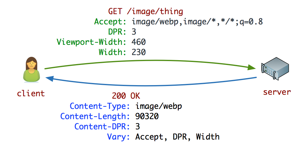
Client Hints in a nutshell
- Enable Client Hints adding the following meta tag to the HEAD section: <meta http-equiv="Accept-CH" content="DPR, Viewport-Width, Width">
- The browser will now append the DPR, Width and Viewport-Width headers to all subsequent requests generated from the HTML, including CSS, JavaScript and so on (with exception of Width, which, in practice, applies only to images
- The server will serve the optimal image variant based on its own set of policies.
- The browser render the optimized image
Source: https://developers.google.com/web/updates/2015/09/automating-resource-selection-with-client-hints
Responsive images with Client Hints!
            <html>
              <head>
                <meta http-equiv="Accept-CH" content="DPR, Viewport-Width, Width">
                <meta name="viewport" content="width=device-width,initial-scale=1">
                <link href="style.css" rel="stylesheet">
                <title>My Awesome Page</title>
              </head>
              <body>
                <p>Hi everyone!</p>
                <picture>
                    <img src="/awesome_photo.jpg"
                         sizes="90vw" alt="Awesome photo!">
                </picture>
              </body>
            </html>
- Shipped in Chrome 46
- Under consideration in Firefox and Edge
Image Optimization is Hard
- Determine the appropriate format (vector vs. raster)
- Determine the optimal encoding formats (jpeg, webp, etc.)
- Determine the right compression settings (lossy vs. lossless)
- Determine which metadata should be kept or stripped
- Make multiple variants of each for each display + DPR resolution
- ...
- Account for user's network type, speed, and preferences
Source: https://developers.google.com/web/updates/2015/09/automating-resource-selection-with-client-hints
Automatic Resizing? Yes, please!
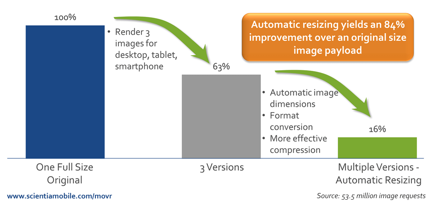
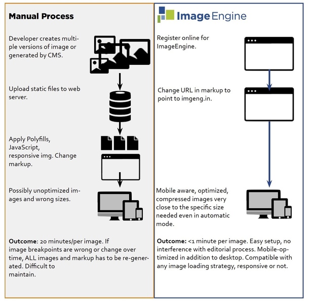
Manual vs Automatic
Responsive images with ImageEngine!
            <html>
              <head>

                <meta name="viewport" content="width=device-width,initial-scale=1">
                <link href="style.css" rel="stylesheet">
                <title>My Awesome Page</title>
              </head>
              <body>
                <p>Hi everyone!</p>
                <picture>
                    <img src="http://<token>.imgeng.in/http://example.com/awesome_photo.jpg"
                         sizes="90vw" alt="Awesome photo!">
                </picture>
              </body>
            </html>
Page Benchmark
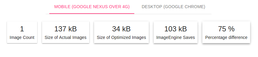
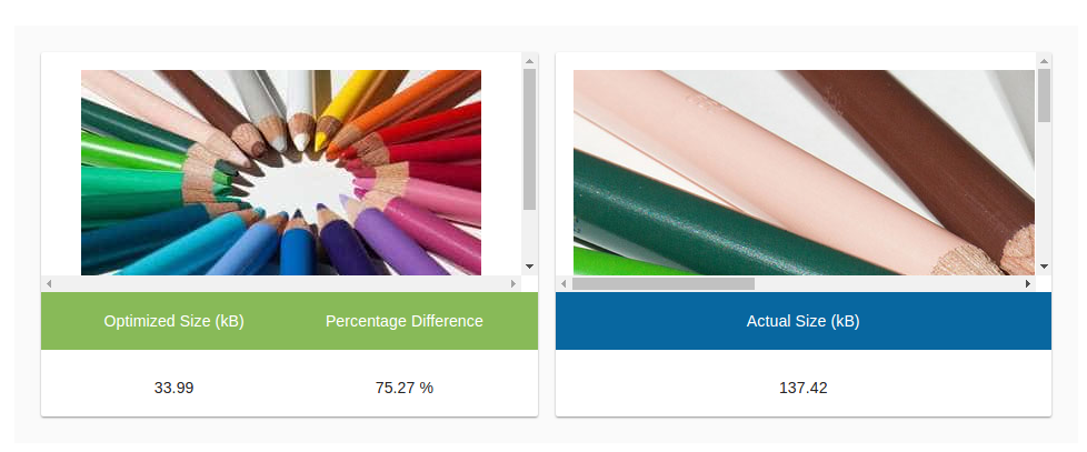
https://demo.imgeng.in/#!/summary/b8486288-bd0a-4495-a3f8-93127d7547c1
Benchmark and improve the quality of your page
| Chrome Dev Tool | https://developers.google.com/web/tools/chrome-devtools/ |
| Lighthouse | https://developers.google.com/web/tools/lighthouse/ |
| Webpagetest | https://www.webpagetest.org/ |
| ImageEngine Tool | https://demo.imgeng.in/ |
Still not convinced?
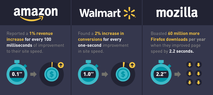
https://wpengine.com/blog/site-speed-infographic
Luca Corbo
Slides: https://lucor.dev/talks/rwd++
Twitter: @lucacorbo
Github: @lucor
Headquarter: Reston Virginia Development Centers in US, Italy and India |
WURFL, Wireless Universal Resource FiLe FOSS Project 2001 thru 2011 Commercial in 2011 with ScientiaMobile |
We are hiring!